Energy Performance Dashboard
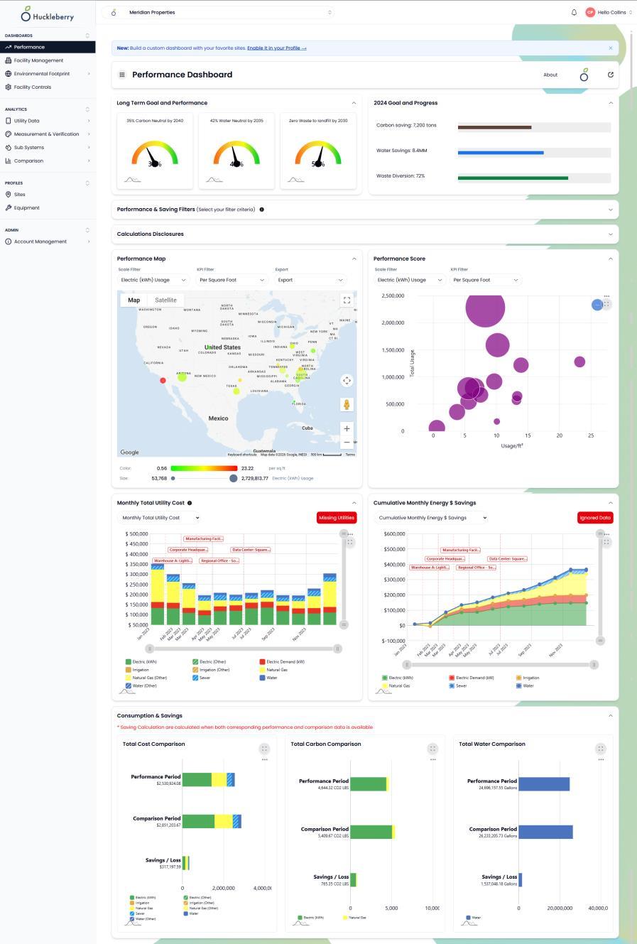
Most energy reporting answers the question “what did we spend last month?” The harder question — are we actually better than we were, once you account for a colder winter and two new buildings — is the one the Performance Dashboard is built to answer.
Progress against a baseline, not just last month
Every organization that has committed to a reduction target needs to show movement against a fixed starting point. The dashboard holds your baseline year and reports current cost, consumption, carbon, and water against it — for the whole portfolio and for any individual site.
Period-over-period comparisons sit alongside that: this month against last, this year against the same months last year. The two views answer different questions. One tells you whether the strategy is working; the other tells you whether something broke in March.
Weather and milestone normalization
Raw year-over-year comparisons are close to meaningless in a building. A mild winter can make a mediocre year look excellent, and an unusually hot August can bury real gains. Huckleberry normalizes for weather so the comparison reflects operations rather than the climate.
Milestones handle the other kind of distortion — the ones you cause on purpose. Add a building, close a wing, change occupancy, install a chiller: mark it as a milestone and the comparison accounts for the step change instead of reporting it as a failure. Custom independent variables, such as production volume or headcount, can be modeled the same way.
The whole portfolio on one map
Performance is mapped geographically, so regional patterns surface without anyone building a pivot table. A cluster of underperforming sites in one climate zone, or one operating region, is a different problem from a single bad building — and it is a difference that is nearly invisible in a list.
Built for the conversation you actually have
The dashboard is designed to be the thing you present, not just the thing you query. Cost, carbon, and water are shown together because the people asking rarely care about only one, and normalization is applied by default so the numbers survive the first skeptical question.
Who it’s for
- Executives and finance
- One view of whether the money spent on efficiency is showing up in the bills, with the weather argument already settled.
- Sustainability leads
- Baseline-year progress on carbon and water, in the shape ESG disclosures ask for.
- Regional facility managers
- See which sites in your region are moving the wrong way before the annual review does it for you.
Related modules
- Environmental FootprintCarbon and water tracked against your baseline year, normalized by the KPIs your organization reports on, and exportable as audit-ready ESG reports.
- Rank & SortRank every site side by side on cost, usage, demand, or any custom KPI, with service-type breakdowns and normalization that makes the comparison fair.
- Measurement & VerificationWhole-facility regression-based savings verification to IPMVP Option-C, weather-normalized, with an auditable monthly breakdown and a scheduled Report Card.
See it against your own sites
The fastest way to judge this is to point it at a handful of your buildings and see what comes back.
Request a demo